GCAS Strategies 17 Presentations: Active preparation

Preparing for a presentation

Prepare by noticing key points

In this lesson, we'll work on understanding graphs, noticing key points and preparing well.

Introduction

In the GCAS, you have 90 seconds to prepare for your presentation. Try that now.

Your teacher will time you. Do your best to understand all the key points from this graph.

Set a timer for 1:30 (90 seconds), or just keep track of the time on your phone or with TimeandDate.com's online stopwatch

The graph shows percent above average.

  • E.g.: App/web use on mobile was 4% above average for women in 2018 (compared with the general population).

This graph is intentionally difficult to help students carefully analyse, rather than assume. However, if the graph seems too difficult for your students, use a mock test question (Part 2 presentation graphics) instead. 

Low-level students

Beginners may need directions.

  1. Read the titles.
  2. Check the numbers.
  3. Notice differences or comparisons.
  4. Highlight what you think is the key point.

High-level students

Cultural insight:

  1. English-speaking cultures tend to value specific information.
    • Get to the main point quickly.
    • Don't worry much about why.
    • Don't worry much about context.
  2. Asian and some European cultures value holistic information.
    • Arrive at the main point eventually.
    • Discuss why, be open to debate.
    • Explain all the information.

So, in America, Britain and other English-speaking countries, get specific, quickly.

Your student may find this difficult, even if they have excellent language skills.

Read Tailor Your Presentation to Fit the Culture, and Are you a Holistic or Specific Thinker?


Warm Up

How should you prepare before presenting a graph?

Tips to use the 90 seconds effectively:

  1. Read all the parts of the graph. Don't get stuck on one part—check it all.
    • What is being measured?
    • How is it measured?
    • Is there a time element?
    • Are two (or more) things being compared?
  2. Is there a general trend?
  3. Can you find at least one key point?

If possible, circle or annotate the graph. You can do this when you practice.

Advice: Do not present all the information. Rather, scan the graph, decide which point is key, and highlight it. (See Introduction notes, above.)

Language

A. Gather information

The first step is to read the graph.

With your teacher, answer the following questions about the graph above. 

  1. What does the graph measure?
    • Note what, who, when, and where.
  2. How does the graph measure it?
  3. Is there a time element?
  4. Are two (or more) things being compared?

Practice: Present the information above in your own words. If you have trouble, your teacher can help.

B. Find a general trend

The next step is to understand, in general, what the graph means.

  • Is there a general trend in the graph above? 

Practice: Present the general trend in your own words. If you have trouble, your teacher can help.

C. Find a takeaway

The final step is to select one (or more) point(s) to highlight.

  • Is there a key takeaway from the graph, above?

Practice: Present the key takeaway in your own words. If you have trouble, your teacher can help.

A. Gather information

Look at the graph in general. Don't get stuck on one part. Try to notice all the parts quickly.

  1. What does the graph measure?
    • What: mobile phone use
    • Who: of women
    • When: in 2018
    • Where: (not shown in the graph)
  2. How does the graph measure it—tricky but important. Read the graph carefully.
    • Time spent in percent above average.
  3. Is there a time element—one time, or progress over time?
    • in 2018
    • weekly time spent
  4. Are two (or more) things being compared?
    1. Women's smartphone vs. women's tablet use. (The two graphs.)
    2. Women's mobile use vs. average for the general population (Explained at the bottom and outlined above: "2. How does the graph measure it?")

Practice:
Your student should produce something like this. Key phrases in bold.

  1. This graph shows...
    • women's mobile phone and tablet use in 2018.
  2. It's measured in...
    • weekly time spent compared with the entire adult population.
  3. We can see this graph compares...
    • women's smartphone and tablet use versus the entire adult population's.

B. Find a general trend

The next step is to understand, in general, what the graph means.

  • Is there a general trend in the graph, above? 

Practice: Your student should produce something like this. Key phrases in bold.

  1. Generally speaking...
    • women use tablets more than smartphones.
  2. In general...
    • women use mobile devices more than the average population (100 = average; all points are at or above 100).
  3. We can see that...
    • social networking is popular on both smartphones and tablets.

C. Find a takeaway

The final step is to select one (or more) point(s) to highlight.

  • Is there a key takeaway from the graph, above?

Practice: Your student should produce something like this. Key phrases in bold.

  1. One key point is...
    • women tend to use tablets for streaming audio much more than average, compared with smartphones.
  2. I'd like to point out that...
    • social networking is the one thing women use smartphones for.
Practice

Look at the graph below.

Take 90 seconds to read the graph, notice a general trend and select a key takeaway. Then present the information to your teacher.


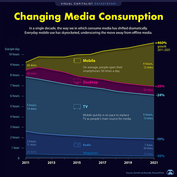
[For more on the graph, see this discussion post from The English Farm: "Visuals: Time we spend on phones"]